Think of a logo design that comes first when you think of a logo. Have you thought? Why did you think that particular logo? What elements do you like in that logo or what did you dislike?
Or this is this way, think of some web design services company product you have seen recently, which is still there in your mind. Why such designs stays in our minds? Most likely the features you liked or disliked is because of the positive and negative space in a design. What are these spaces and why are they so effective is a detailed art which the designers and artists are incorporating in their artwork to make the work look more artistic and attractive.
About Negative Space
Negative space is much more appealing than positive space in the design world. It is an exciting field in the design field, where designers use alternate colors in a logo, website or an icon design to give a dual look of an image or a layout.
Negative space also stated as white space is, fairly the space that surrounds an image in an image. It helps in defining the outline of an active area in an image along with delivering a meaning itself. Just as important as that design itself, negative space brings balance to a composition of both positive and negative areas.
Importance of Negative Space
A negative space incorporates multiple meanings in a design either it is a logo, icon or a web design. The creative world is seeing the rise of designers who are making positive spaces and outlines that, in turn, smartly carve out shapes in negative space which is done intentionally to make the results look impressive. The hidden message within a logo not only grabs the viewer’s attention but will also tells them about the brand.
You must have heard that in some scenarios less is always more; it is the same how negative spaces despite being less gives a more appealing effect and makes a logo stand different from the other logo designs.
Let us consider few examples in which negative spaces have made their way in making a logo look fabulous.
One Design

What do you interpret from the above logo design? The one in the logo is incorporating two meanings within an image, did you see that? The one in the logo could also be written as “one “ or a number “1” , but see how the negative space is being used in it. The number “1” is cut in such a way incorporating a negative space which is making a letter “N” within the number “1”.
They could have easily written 1 or one, but putting in the concept of a negative space have made the logo design look different and attractive, much more of a memorable one.
Edgar Rubino

Look at the above picture, what do you see? Two faces or a curved vase? It a dual imagery with a combination of the black and white space, in which both are complementing each other.
If you see the faces at a glance, it is because of the negative image in white that is enhancing the look of the faces i.e. the black part in this particular design.
Similarly, if we then see it the other way, the white part which is the negative space is more prominent because of the two faces in black. It is how a balance is maintained between the two while enhancing the look of each other.
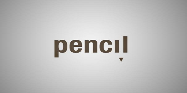
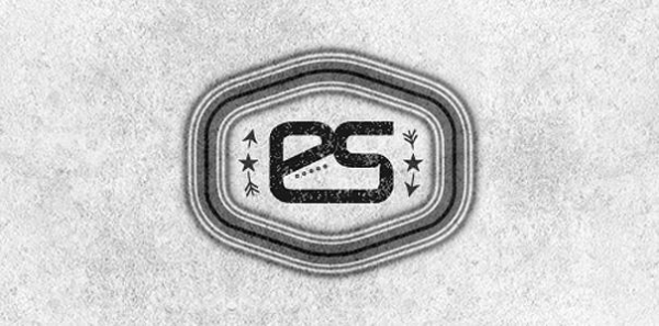
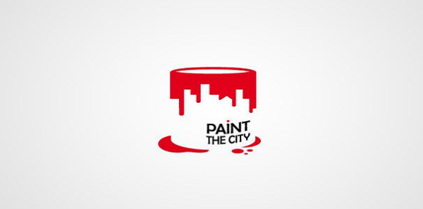
However now you must be clear about how a design is created using a dual effect of white and black spaces. Why don’t you exercise your mind and identify the meaning of the below images? These pictures have a double meaning with the presence of negative and positive areas. Why don’t you identify to get a clear understanding of negative and positive element in your designs?
Pencil

Royal clothes

Suitcase

Carrefour logo

Endurance Shoes

Paint the City

What did you perceive looking at the above examples of design using white spaces? It is now fair to say that a professional logo design company can surely do a lot with a little. We see designs every minute or second if being more specific, what makes a design attractive is the negative space in it which interrelates with the brain which other designs cannot. A design with an excellent composition of positive and negative spaces sets itself different from the other dull designs whether it be a website or a logo.
Negative Space in Web Designing
If we consider these areas in a web design, then you must differentiate it in a way that the elements of your site such as content, navigation, icons, and images are the positive spaces whereas the negative spaces are the white spaces, the empty white spaces between the positive elements.
Now, the idea of these areas in a web design is clear to you, but these spaces are furthermore categorized as micro area, which is white space between small elements as in between images or contents. The other is macro space which is the vast empty spaces between sections far away; it could be a space between a header and a footer. Though we call it a white space, it is not necessary for it to be in white color. The blank space can be filled with any other color but must fulfill its core purpose which is to shape elements and images and draw viewers’ attention to it.
The custom website design companies have embedded “simplicity is the best policy” in their web designs. A web design must be catchy yet being simple; the elements should not be cluttering in the layout. Web designs that create distance between its components and allows the page to breathe are the most productive ones. It should not be putting the viewer in the thought of where to click and how to proceed. Negative spaces are indeed used to enhance the visibility of individual elements or vice versa on the page, but it should be considered as having more space between element forces it to stand out against the overall composition.
Conclusion:
The odyssey of negative space (white space) is a never an ending part in making website layouts, icons, and logos. Although it is complicated to syndicate white spaces, there are many custom logo and website design firms which are mainly looking into these minute yet prominent design elements while developing.
Despite being difficult, it has its charm when the final layouts are presented and if one knows how to do it, then there it assures that the design will be liked and memorized by the viewers. However, once you can do it, it is not something to be overlooked or avoided.


